
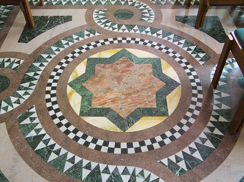
Tile floor at the Cathedral Basilica of Saint Louis.
Abstraction in and of itself is not a problem. Truly, the finest churches of the world were covered with abstract art, as was their prototype, the Jewish Temple in Jerusalem. Instead the place in our hearts which loves beauty suffers from a lack of abstract — that is, decorative — art. Plainness and nullity now rule, while abstraction allows us to incorporate much symbolism. The artistic degradation of the icons in a church is another problem, though related.
I offer this excerpt from the book The Grammar of Ornament (1856), by Owen Jones (1809 - 1874), who was perhaps the 19th century's greatest design theorist. This book takes a catholic — universal — approach to ornament, and discovers that the use of ornament in diverse places and eras follows the natural law, which he attempts to present here. Ornament suffers in our age due to the denial of this natural law.
[My comments are in red.]
General principles.
Proposition 1. The Decorative Arts arise from, and should properly be attendant upon, Architecture.
Proposition 2. Architecture is the material expression of the wants, the faculties, and the sentiments, of the age in which it is created. Style in Architecture is the peculiar form that expression takes under the influence of climate and materials at hand.
Proposition 3. As Architecture, so all works of the Decorative Arts, should possess fitness, proportion, harmony, the result of all which is repose. [This can be found in Aquinas.]
Proposition 4. True beauty results from that repose which the mind feels when the eye, the intellect, and the affections are satisfied from the absence of any want. [Also in Aquinas. Beauty is a final cause, or end in itself.]
Proposition 5. Construction should be decorated. Decoration should never be purposely constructed.
That which is beautiful is true; that which is true must be beautiful. [This statement needs to be qualified.]On general form.
Proposition 6. Beauty of form is produced by lines growing out one from the other in gradual undulations: there are no excrescencies; nothing could be removed and leave the design equally good or better. [Art should not be simple as possible, but rather no simpler or more complex than required.]
Decoration of the surface.
Proposition 7. The general forms being first cared for, those should be subdivided and ornamented by general lines; the interstices may then be filled in with ornament, which may again be subdivided and riched for closer inspection. [Interesting detail on a human scale is what tends to be missing these days.]
Proposition 8. All ornament should be based upon a geometrical construction. [Jones dislikes naturalistic detail; however even the complexity of the Gothic rises from simple geometric construction.]
Proposition 8. All ornament should be based upon a geometrical construction. [Jones dislikes naturalistic detail; however even the complexity of the Gothic rises from simple geometric construction.]
On proportion.
Proposition 9. As in every perfect work of Architecture a true proportion will be found to reign between all the members which compose it, so throughout the Decorative Arts every assemblage of forms should be arranged on certain definite proportions; the whole and each particular member should be a multiple of some simple unit.
Those proportions will be the most beautiful which it will be most difficult for the eye to detect. Thus the proportion of a double square, or 4 to 8, will be less beautiful than the more subtle ratio of 5 to 8; 3 to 6, than 3 to 7; 3 to 9, than 3 to 8; 3 to 4, than 3 to 5. [Music also follows similar laws - ratios of small prime numbers are generally pleasing.]
On harmony and contrast.
Proposition 10. Harmony of form consists in the proper balancing, and contrast of, the straight, the inclined, and the curved.
Distribution. Radiation. Continuity.
Proposition 11. In surface decoration all lines should flow out of a parent stem. Every ornament, however distant, should be traced to its branch and root. Oriental practice.
Proposition 12. All junctions of curved lines with curved or curved lines with straight should be tangential to each other. Natural law. Oriental practice in accordance with it. [No discontinuities of slope in continuous curves.]
Proposition 12. All junctions of curved lines with curved or curved lines with straight should be tangential to each other. Natural law. Oriental practice in accordance with it. [No discontinuities of slope in continuous curves.]
On the conventionality of natural forms.
Proposition 13. Flowers or other natural objects should not be used as ornaments, but conventional representations founded upon them sufficiently suggestive to convey the intended image to the mind, without destroying the unity of the object they are employed to decorate. Universally obeyed in the best periods of art, equally violated when Art declines. [Avoid naturalism. Abstract representation of nature OK.]
On colour generally.
Proposition 14. Colour is used to assist in the development of form, and to distinguish objects or parts of objects one from another.
Proposition 15. Colour is used to assist light and shade, helping the undulations of form by the proper distribution of the several colours.
Proposition 16. These objects are best attained by the use of the primary colours on small surfaces and in small quantities, balanced and supported by the secondary and tertiary colours on the larger masses. [Note how he defines primary colors, further down the page.]
Proposition 17. The primary colours should be used on the upper portions of objects, the secondary and tertiary on the lower.
On the proportions by which harmony in colouring is produced. [Color theory is complex, and the following may be problematical; further study needed. It does not correspond too well with the color theory I use in my photography: both additive and subtractive primary colors are defined differently.]
Proposition 18. (Field's Chromatic equivalents.) The primaries of equal intensities will harmonize or neutralize each other, in the proportions of 3 yellow, 5 red, and 8 blue, — integrally as 16.
The secondaries in the proportions of 8 orange, 13 purple, 11 green, — integrally 32.The tertiaries, citrine (compound of orange and green), 19; russet (orange and purple), 21; olive (green and purple), 24; — integrally as 64.It follows that, —Each secondary being a compound of two primaries is neutralized by the remaining primary in the same proportions: thus, 8 orange by 8 blue, 11 of green by five of red, 13 purple by 3 yellow.Each tertiary being a binary compound of two secondaries, is neutralized by the remaining secondary: as, 24 of olive by 8 of orange, 21 of russet by 11 of green, 19 of citrine by 13 of purple.
On the contrasts and harmonious equivalents of tones, shades, and hues.
Proposition 19. The above supposes the colours to be used in their prismatic intensities, but each colour has a variety of tones when mixed with white, or of shades when mixed with grey or black. When a full colour is contrasted with another of a lower tone, the volume of the latter must be proportionally increased.
Proposition 20. Each color has a variety of hues, obtained by admixture with other colours, in addition to white, grey, or black: thus we have of yellow — orange-yellow on the one side, and lemon-yellow on the other; so of red, — scarlet-red, and crimson-red; and of each every variety of tone and shade. When a primary tinged with another primary is contrasted with a secondary, the secondary must have a hue of the third primary.
On the positions the several colours should occupy.
Proposition 21. In using the primary colours on moulded surfaces, we should place blue, which retires, on the concave surfaces; yellow, which advances, on the convex; and red, the intermediate colour, on the undersides; separating the colours by white on the vertical planes.
When the proportions required by Proposition 18 cannot be obtained, we may procure the balance by a change in the colours themselves : thus if the surfaces to be coloured should give too much yellow, we should make the red more crimson and the blue more purple — i.e. we should take the yellow out of them ; so if the surfaces should give too much blue, we should make the yellow more orange and the red more scarlet. [Again, this does not directly correspond to the photographic use of color (yellow is the opponent color of blue and so more blue will neutralize too much yellow), but then I don't know what pigments he was using.]
Proposition 22. The various colours should be so blended that the objects colored, when viewed at a distance, should present a neutralized bloom. [This principle is seen in the altar decoration at Saint Francis de Sales Oratory in Saint Louis, where red, blue, and gold edging blend together at a distance, yet still provide optical contrast around edges.]
Proposition 23. No composition can ever be perfect in which any one of the three primary colours is wanting, either in its natural state or in combination. [One principle of photographic color correction is that an image ought to show a full range of tones.]
Proposition 23. No composition can ever be perfect in which any one of the three primary colours is wanting, either in its natural state or in combination. [One principle of photographic color correction is that an image ought to show a full range of tones.]
On the law of simultaneous contrasts of colours, derived from Mons. Chevreuil. [These apply very well to photography.]
Proposition 24. When two tones of the same colour are juxtaposed, the light colour will appear lighter, and the dark colour darker. [This is a well-attested optical phenomenon.]
Proposition 25. When two different colours are juxtaposed, they receive a double modification; first, as to there tone (the light colour appearing lighter, and the dark colour appearing darker); secondly, as to their hue, each will become tinged with the complementary colour of the other.
Proposition 26. Colours on white grounds appear darker; on black grounds, lighter.
Proposition 27. Black grounds suffer when opposed to colours which give a luminous complementary.
Proposition 28. Colours should never be allowed to impinge upon each other.
On the means of increasing the harmonious effects of juxtaposed colours. Observations derived from a consideration of Oriental practice. [These rules agree with those found in European Heraldry.]
Proposition 29. When ornaments in a colour are on a ground of a contrasting colour, the ornament should be separated from the ground by an edging of lighter colour; as a red flower on a green ground should have an edging of lighter red.
Proposition 30. When ornaments in a colour are on a gold ground, the ornaments should be separated from the ground by an edging of a darker colour.
Proposition 31. Gold ornaments on any coloured ground should be outlined with black.
Proposition 32. Ornaments of any colour may be separated from grounds of any other colour by edgings of white, gold, or black.
Propositions 33. Ornaments in any colour, or in gold, may be used on white or black grounds, without outline or edging. [In photography, this corresponds to high-key and low-key images; these are highly recommended for portraiture, since a figure on a black or white background is emphasized. Color backgrounds can cause problems with the subject.]
Proposition 34. In “self-tints,” tones, or shades of the same colour, a light tint on a dark ground may be used without outline; but a dark ornament on a light ground requires to be outlines with a still darker tint. [This is similar to the artificial sharpening added to photos. It gives greater definition.]
On imitations.
Proposition 35. Imitations, such as the graining of woods, and of the various coloured marbles, allowable only, when the employment of the thing imitated would not have been inconsistent. [Interesting.]
Proposition 36. The principles discoverable in the works of the past belong to us; not so the results. It is taking the end for the means. [Jones did not like the mere copying of historic forms to new buildings. Things must be adapted to the use at hand.]
Proposition 37. No improvement can take place in the Art of the present generation until all classes, Artists, Manufacturers, and the Public, are better educated in Art, and the existence of general principles is more fully recognized. [Amen.]

No comments:
Post a Comment