
While violet (or purple) vestments are generally used during this season of anticipation, this particular Sunday's liturgy has a joyful aspect which developed over the centuries, as the Introit of this Mass suggests:
Gaudéte in Dómino semper: íterum dico, gaudéte.As a part of this special character of this liturgical day, rose vestments may be optionally worn.
Rejoice in the Lord always; again I say, rejoice!
Here is the text from the General Instruction of the Roman Missal, in Latin:
346. Ad colorem sacrarum vestium quod attinet, servetur usus traditus, nempe: ....And the U.S. version of the GIRM:
f) Color rosaceus adhiberi potest, ubi mos est, in dominicis Gaudéte (III
Adventus) et Lætáre (IV in Quadragesima).
346. As to the color of sacred vestments, the traditional usage is to be retained: namely, ...Apparently, the use of rose vestments was largely abandoned after the introduction of the Missal of Pope Paul VI, forty years ago, although I can't say from my own knowledge. I'm told that the use of rose vestments is now increasing.
f. Rose may be used, where it is the practice, on Gaudete Sunday (Third Sunday of Advent) and on Laetare Sunday (Fourth Sunday of Lent).
Since my being received into the Catholic Church in 2003, only once have I seen a priest not wearing this distinctive color on one of the prescribed Sundays: the reason he gave is that he doesn't like wearing pink. Of course, that is his decision. Also, vestments aren't cheap, especially considering that these are used only two days a year. But pink is not a liturgical color, rose is. However, most so-called rose vestments I've seen are most definitively pink. This is a contemporary phenomena: many of these bright colors are made with synthetic dyes of recent origin.
Personally, I don't care much for pink, and it seems unfitting for the Holy Sacrifice of the Mass. So instead, let's consider what rose is, and see if it is different than pink.
According to the Lewis and Short dictionary — the best English-Latin dictionary for ecclesiastical translations — Color rosaceus is ‘rose color’, and not pink. Roses can be many colors — red, white, orange, yellow, even blue — and so it is illogical that the Church would mean that the color of any rose will do. Perhaps there is a more specific rose.
Let's consider the English color names of rose and pink. Looking at authoritative color name sources, I came up with lists of colors that have rose and pink in their names. I plotted the various color names to color coordinates. (I used the CIELab color space which closely models how human color vision works.)

This above chart shows bounding triangles where the rose and pink color names fall. Here all colors were converted to the same luminosity. There are two opponent-color axes here, green-magenta from left to right, and yellow-blue from top to bottom. (The actual colors shown here are relative and not completely accurate, due to the limits of most computer monitors and popular web browsers. All colors were adjusted to have the same CIELab measure of luminosity.)
Obviously there is considerable overlap between the colors, but there are significant differences. Rose ranges towards more yellow than blue, and also less magenta; pink goes towards more blue and magenta.
The following chart shows the luminosity differences between rose colors and pinks:
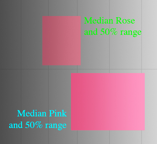
The colored rectangles shows the median rose and pink hues, as well as showing the bounds of luminosity where the middle half of each color range lies. Pink tends to be brighter than rose.
Computers and digital cameras record colors in terms of red, green, and blue channels. 54% of pink colors have a fully saturated red channel, compared to 24% of rose colors.
I hope that I have demonstrated that rose is not the same thing as pink, although there is overlap.
However, under the most common form of color blindness found among men, it appears that pink colors may generally look better than rose colors: the pinks usually appear to be nice pale blues, while the roses tend to look more like drab yellows.
The phenomena of color has subjective, relative, and objective factors. Color blindness is frequent, and colors have different connotations to various cultures and individuals. The subjective and relative factors regarding color may lead us to consider liturgical color either as a matter of personal preference, or as blind obedience to Church positive law — in other words, arbitrary choices. But we should not descend into pure relativism: although certainly we do have a wide range of legitimate choice, and faithful Catholics should form themselves to the mind of the Church, we ought to find objective facts regarding color in the material world, in human nature, and in higher things.
From the General Instruction of the Roman Missal:
345. The purpose of a variety in the color of the sacred vestments is to give effective expression even outwardly to the specific character of the mysteries of faith being celebrated and to a sense of Christian life's passage through the course of the liturgical year.To “give effective expression even outwardly” implies an objective component to the symbol of color. Colors ought to imply, symbolize, or move us even outside of the bounds of liturgical law.
The starkest color symbolism is between white and black. Not only is white a symbol of being, and black of non-being, white is in fact a presence and black is an absence. In cultures around the world, these two colors are intimately associated with life and death, good and evil, and ultimate final things. These colors are likewise used in the liturgy: black for death and white for ultimate triumph.
Some colors are strongly influenced by nature, such as red and blood, green and vegetation, gold of the sun, and the blue of the sky. These colors remind us that we are human and that we live on the Earth. These colors are not liturgically inappropriate: as God made the world and it was very good, so too was Christ made flesh, and dwelt among us. Pure spiritualism has no place in Christianity.
Whether or not the liturgical colors of violet and rose have any distinct natural or even an unlikely metaphysical meaning, or whether they are merely historical or culturally relative, I don't know. Violet — or purple or scarlet — are associated with royalty due to the ancient cost of that color dye, although we must not think that this is the only reason.
In the absence of concrete evidence, we can resort to the sociologist's favorite tool, the public opinion poll. The Cymbolism website asks viewers to vote on color connotations for various words. At the time of this writing, the viewer is presented with one of 253 words, the viewer then asked to select one out of 19 colors to correspond with that word. There are currently over 400,000 votes, so patterns in voting are quite evident.
According to the Cymbolism poll, some words have no practically significant color connotations, while others are very strong. We can also look up colors to see the word connotations; even though the color palette is limited, we still ought to get some ideas. The closest Cymbolism color to pink is Fuchsia, and its top five related words are: cute, female, vanity, dance, and silly. This tells us that pink may not be an appropriate liturgical color.
According to the liturgical texts, the usual color for Advent and Lent is violaceus or violet. Violet is a spectral color, found in the rainbow, where it is beyond blue and the elusive indigo before being lost to invisible ultraviolet radiation. A digital camera, properly exposing a pure saturated violet color, would record white in the blue channel, and black in the red and green channels. However many digital cameras and computer monitors cannot record or render indigo and violet accurately — they are out of the gamut of colors specified by the sRGB color standard used in the electronics industry.
Purple is a mixture of red and blue and so is not found in the spectrum, but unlike violet, many purple colors can be represented on a computer screen. Note that purple is a mixture of red and blue whereas violet has no red in it whatsoever. But human vision does not act like computer vision, since our eyes measure differences in color components rather than the absolute values of red, green, and blue. So there are some purples which do approximate the color tone of violet. This is Electric Violet, which has approximately the same hue, but less saturation than true spectral violet. You can see a true spectral violet by looking at the bottom of a compact disc or DVD in bright light, and especially under fluorescent light.
As certain pure colors are brightened, the human eye will detect a shift in color, due to the influence of the rod cells in the eye, which are more known for night vision. True violets will look bluer as they are illumined under brighter lights, while purples will look pinker. A lot of people don't like liturgical violet — or rather purple — which makes me wonder if this dislike is due to the use of purple instead of violet, or if this illumination color shift may play some sort of a role.
According to Cymbolism, the words associated with the color purple are mystical, royal, victorian, decadent, and vanity. The first two words are quite interesting, and close to the spirit of the liturgy; but the last two seem problematic. However, if we consider that violet is between dark blue and purple, perhaps the common purple is indeed off or vaguely inappropriate. Words associated with navy blue are: royal, corporate, trust, authority, and conservative, which are close but also slightly off. Cymbolism gives us no intermediate choice, but pure spectral violet, which lies in between, may bring us to the right associations.
Cymbolism does not give us rose as a color choice, but the colors most associated with the word jubilant (the closest word to gaudete) are yellow, fuchsia, and red. Now what color is a mixture of these three? which happens to be fairly close to a classic rose vestment shade, as seen here.
There are many dyes today that can produce rose shades, but the historically most important rose dyes came from the murex shell and the Common Madder plant: the first being exceedingly costly, and the latter being inexpensive and the source of Rose madder dye. Murex dye is famous for producing Imperial purple as well as other colors in the crimson-indigo range which includes rose shades, and Rose madder generally produces colors in the rose range. I would not doubt that ancient vestments were produced by both. In particular, the high priest at the Jewish Temple in Jerusalem was said to have vestments dyed from rose-colored murex. Rose madder is not color-fast and tends to fade to a peach or salmon color with time.

I think my brain just exploded. What would the html code for rose be?
ReplyDeleteSorry about your brain. Hope it gets better.
ReplyDeleteClick here for some rose shades.
Fascinating, thank you! I knew that pink was different than rose, but I never knew just how!
ReplyDeleteWonderful article! Thanks!
ReplyDelete